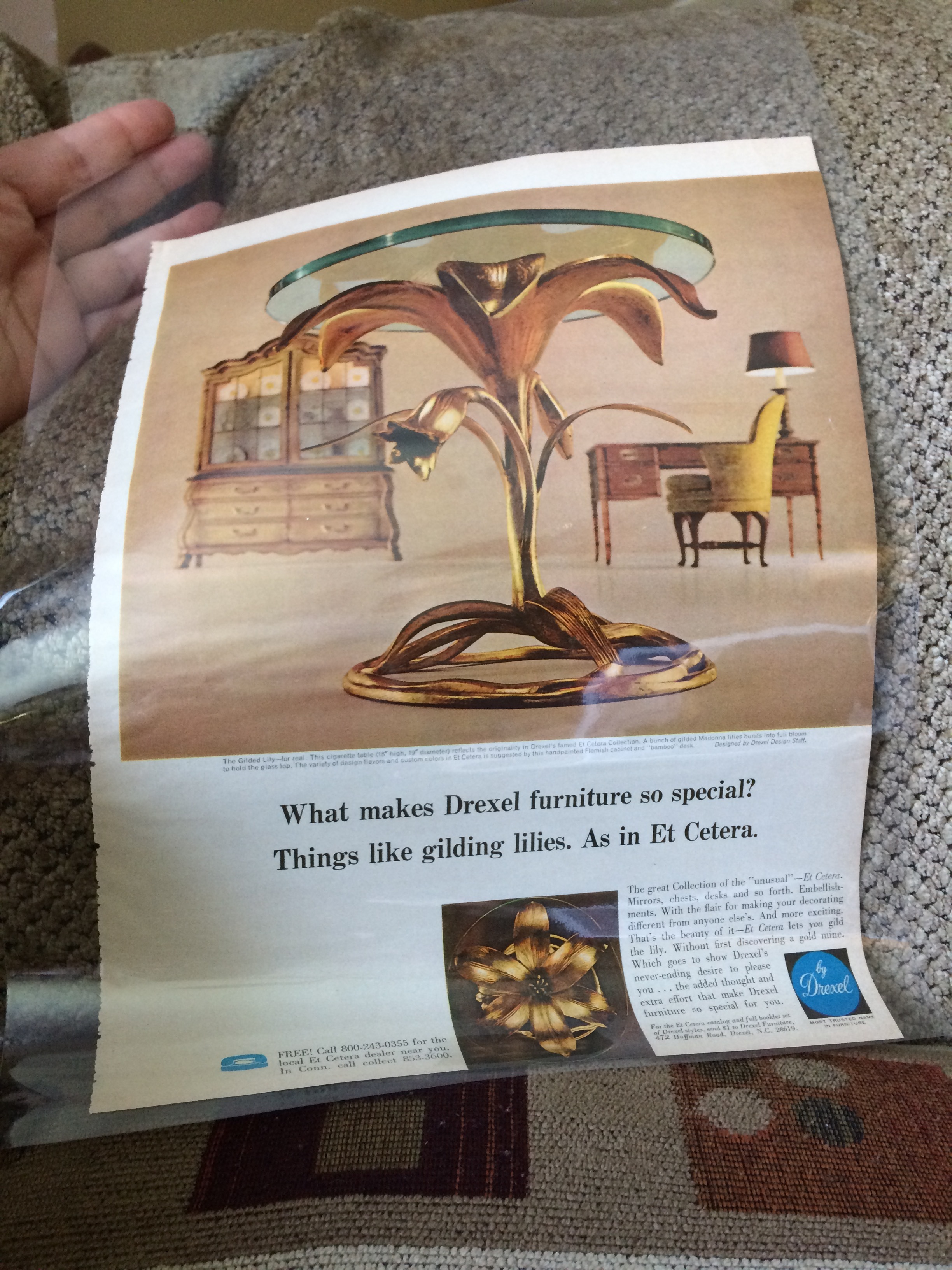
The magazine, Better Homes and Gardens I believe, was dated 1969. I learned that my lily has it's original glass, is definitely cast aluminum and was called a cigarette table. Small in stature to use next to a lounge chair, and the petit table top to feature an interesting ash tray with enough space to hold your pack, a lighter and a cocktail. As cigarette smoking slowly fell out of vogue, so did the use of the association. Like many trends, they come and go. There are still those who enjoy a puff here and there and also those who like to recreate that type of space just to keep the era alive. Whether you choose this piece to accent your nightlife or to bring some incredible lifelike nature indoors, it is sure to charm you and your guests.
My favorite part about the ad is the official description. 'The Gilded Lily-for real. This cigarette table reflects the originality in Drexel's famed Et Cetera Collection. A bunch of Gilded Madonna lilies bursts into full bloom to hold the glass top.' 💕
So what about the designer? Well, I figured out the answer to that as well. The caption under the pic ends in italics 'Designed by Drexel Design Staff'. Arthur Court, the most tagged company (or person) on this piece.....no way. Just another mid century modern urban legend. It is great when we enjoy certain designer's work. I do love carrying highly collectible works from the era's best. But ultimately, these are pieces you will be living with, passing down or reselling later. Take the time to delve into the history. I really try to find out about my items because I am intrigued and do my best to pass that info on. Misattributed items does no favors to the artists who created them and it certainly is shifty, lazy and no better than a used car salesman. ✌️
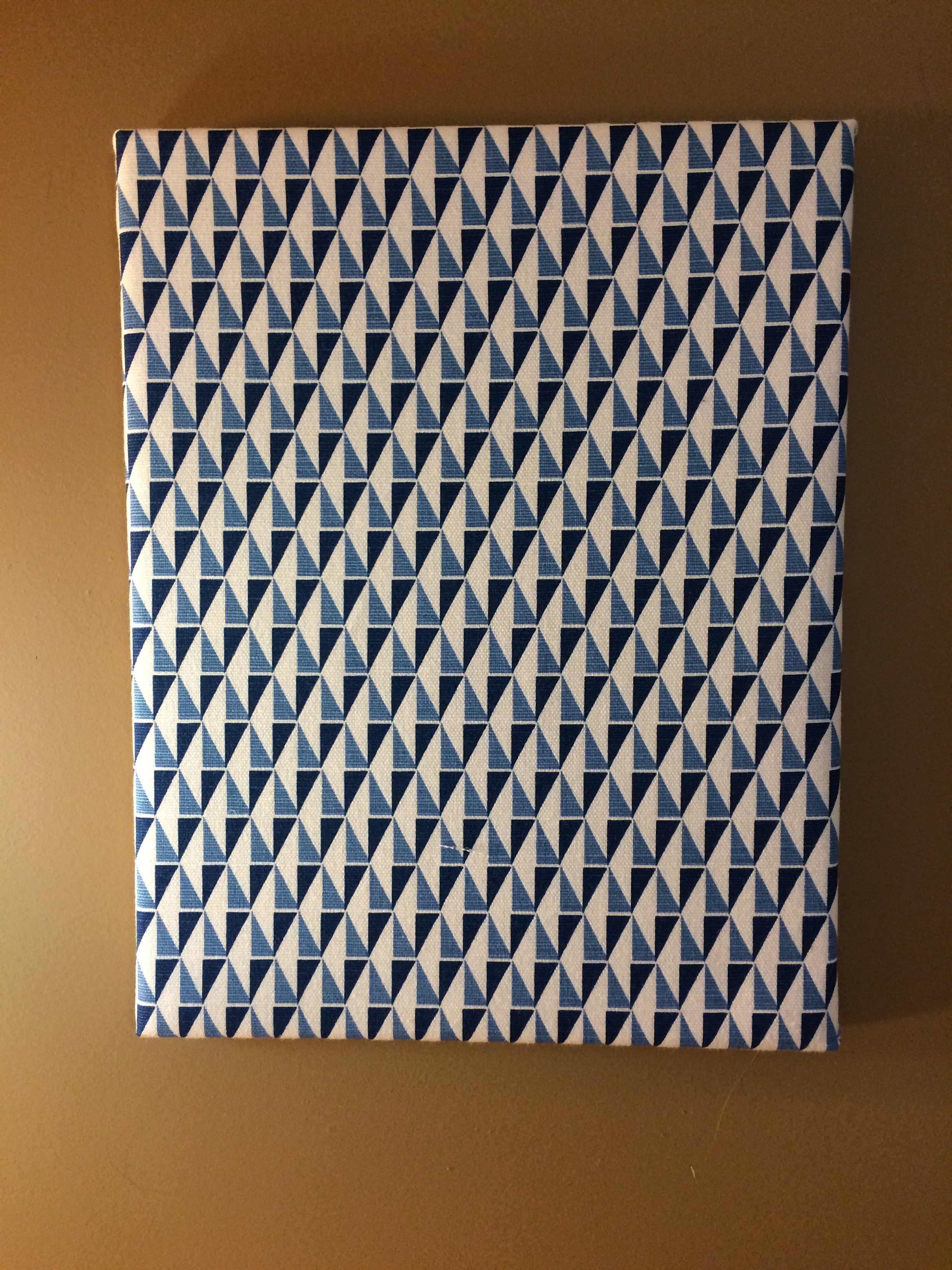
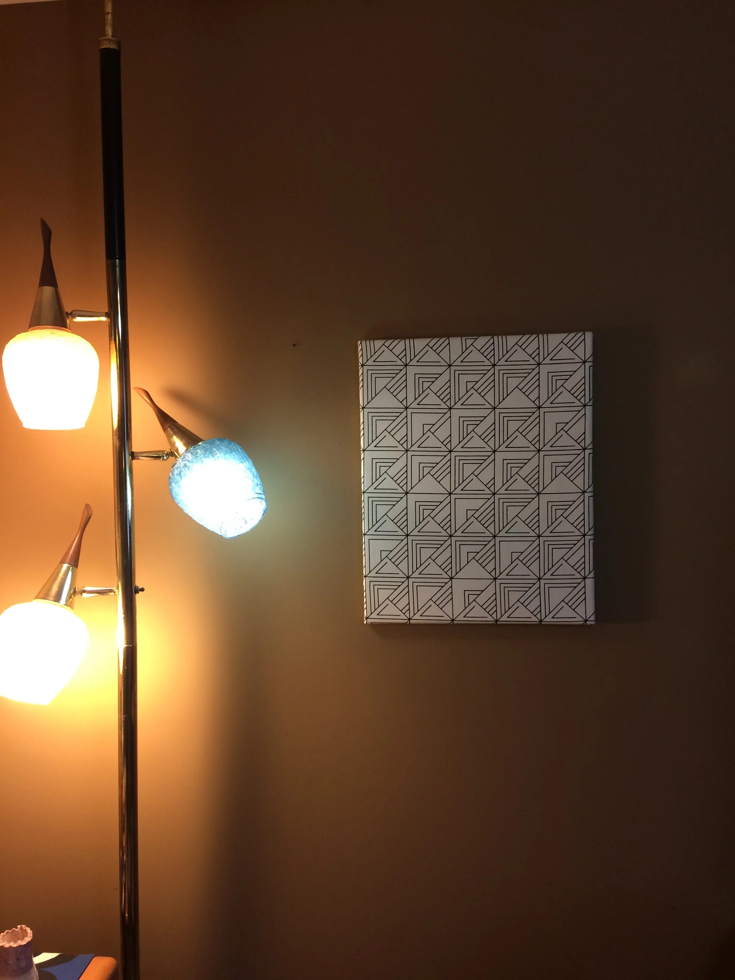
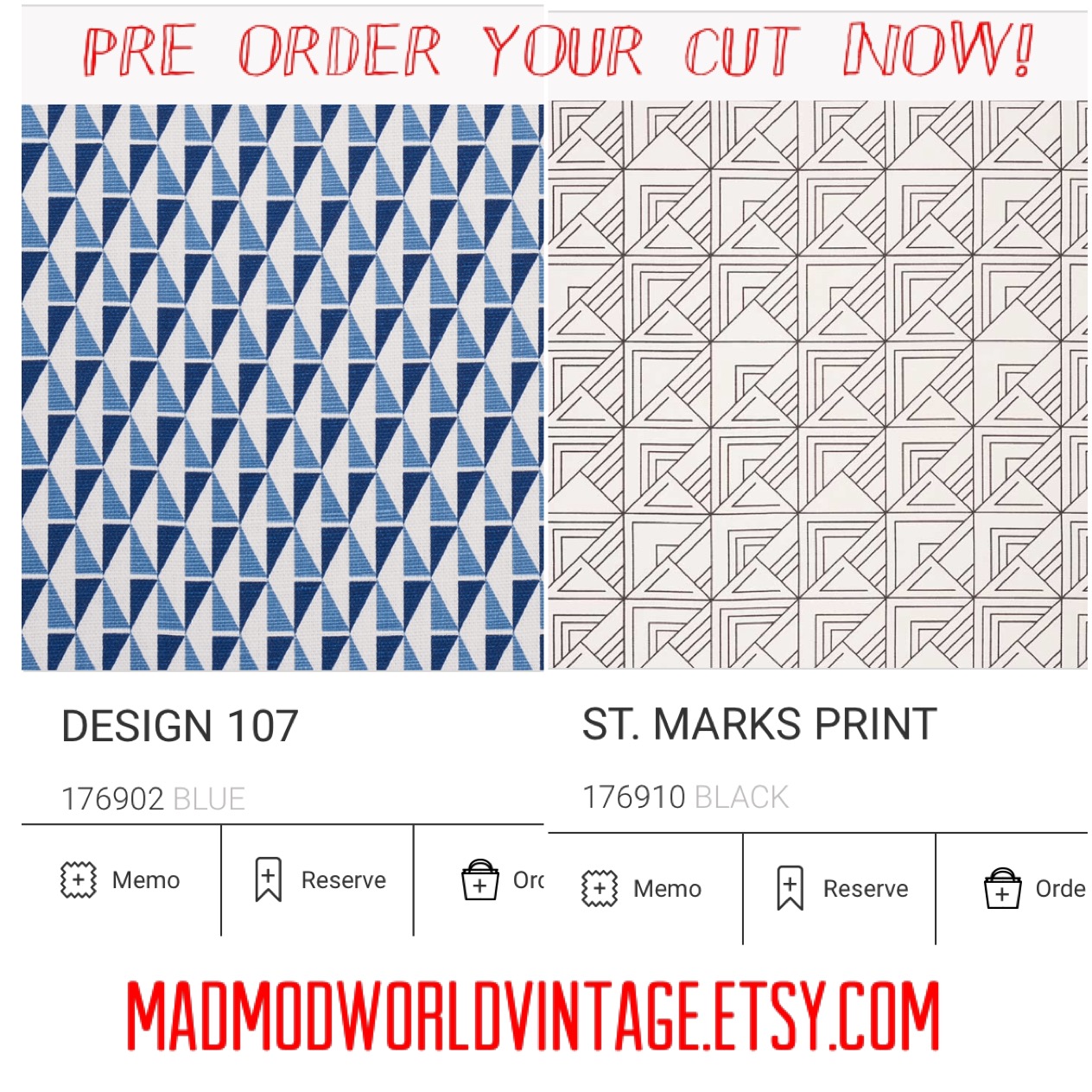
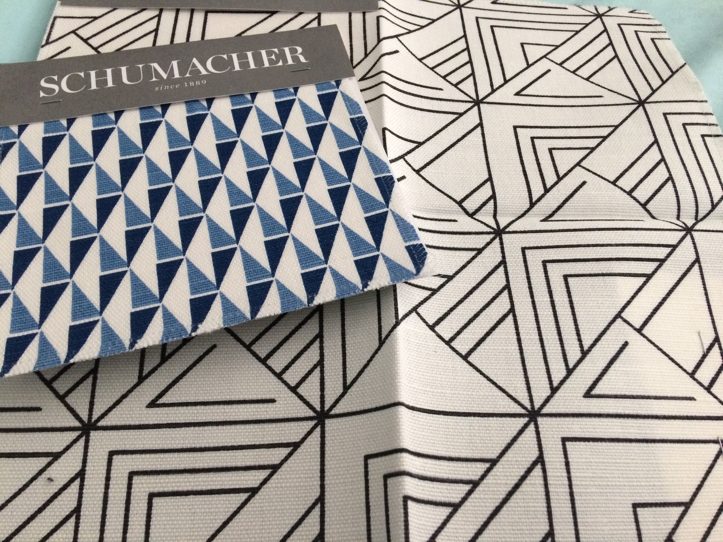
On a final note. I am in the process of stretching some of the amazing Frank Lloyd Wright reissued prints onto canvas for hanging. I figure there are some non crafty folk out there who would like to admire these great designs without having to sew or be creative. If they sell quickly, I will invest into other prints. This fabric is very expensive. On the St Marks Print, I used a large frame as the print repeats every 17". This way you really can see it. I love it against my brown wall. I will be doing the smaller blue print on smaller frames and at a reduced price as I can get more out of a yard. Look for the listing on the smaller ones (11 by 14) over the next few days!
Malissa


